A landing page is a way to attract more customers. However, like any marketing tool, it has a number of requirements and rules. Not every business will be able to fully utilize the advantages of a landing page.
In this article, Bogdan Tymoshenko, CMO of the Ukrainian website builder Weblium, will share tips on how to create an effective landing page and which businesses it will suit.
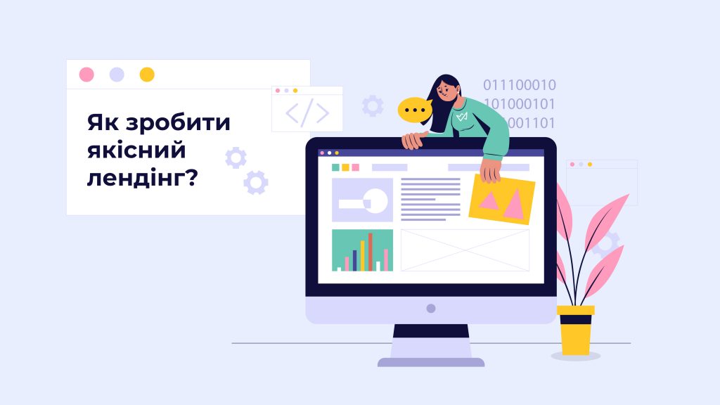
About the landing page: How does it work?
In simple terms, a landing page is an extension of an advertising announcement. If a user sees an ad on Google or a social network about a new service from a company, clicking the link should lead them to learn more about what intrigued them.
In this case, the potential customer learns all about a specific service, sees all its advantages, and understands why it is necessary for them. This prompts an order and converts the visitor into a customer.
When will a landing page not work?
A common mistake is to view the landing page as a universal profit-making method. However, not every business can create a landing page and take advantage of its benefits. Among such companies:
- Online stores. If you are a distributor of certain goods and your advertising shows specific items and discounts on them, then transitioning to a landing page is just an unnecessary step. Additionally, filling such a format page with content will be difficult.
- Businesses selling complex products. One page will not be enough to explain the specifics of a very complex product. If a client does not understand what is being offered while viewing the landing page, they will simply leave.
- Companies selling expensive goods. An expensive product can also be an enemy of the landing page, as it will be hard to convince a client of its necessity in short, bulleted messages.
Typically, by working with professionals in website development or marketing specialists, a company owner can clearly determine if a landing page is suitable for their business.
Key elements of a landing page
A landing page should focus on one thing – presenting a specific product or service. Unnecessary distractions only complicate perception for the potential customer. If we talk about the design of the page, it should include:
- 1 screen = 1 message. Each time a client scrolls through the page, they should see a new message. For example, the first screen shows the product name, the second explains the main essence, starting with the third, the benefits, and at the end, a call to action.
- Short messages. It is important to communicate succinctly, without forcing the reader to delve deep. Typically, it is necessary to state the name of the benefit in one, maximum two sentences, and explain what it means. For example: «Completely understandable. The intuitive design allows you to immediately start working with the tool».
- High-quality images. Each image should reflect the essence of the benefit and the product.
- Calls to action. Each screen should have a call to action. Initially, you might offer «Learn more», after each benefit – «Try», «Buy», «Start», etc., and at the end, it could be «Go to the site».
The main thing is clarity. The landing page should immediately get to the point, and it should not have a long introduction or veiled phrases. Of course, you can create a bit of intrigue at the beginning, describing the revolutionary nature of a certain product. However, this should be followed by clarity and explanation of why this product is a solution for the client.
Landing page design

Design decisions are an individual aspect for each business. However, certain nuances should be considered when creating it.
- The page should not have a large number of links. Buttons on the landing page should only lead to pages related to the advertised product or service.
- Adding forms. Always add feedback forms to collect more data about clients. Forms should be quite simple, maximum 3-4 fields. Ideally, ask the client to leave contact information, such as name and email.
- Minimalist design without distractions. The design of the landing page should not distract. Key elements, such as calls to action, should be clearly visible on the page.
Regarding the color palette, there is no universal solution. In some cases, brands use their standard colors, and in others, they opt for a dark theme for the landing page.
A website builder will allow better navigation during theme changes and selection of the style for the landing page.
Conclusions

A landing page is a great way to draw attention to a specific service and collect necessary data about clients. The main thing is to understand how to create a landing page, what elements are essential for the page, and how to properly implement them in work.
Leave a Reply