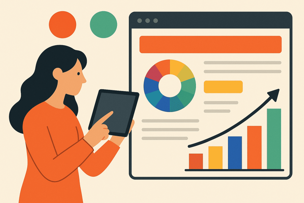
When we open a website or online store, we rarely think about why it looks the way it does. Why is the “Buy” button green, while the background is light and calm? Why do advertisements often use red or orange? In fact, design is not just aesthetics. It is a visual language that influences our feelings, decisions and behavior. And one of the most powerful tools of this language is color. The psychology of color helps us understand how shades can build trust, encourage action, and ultimately increase sales.
Why color matters
Color affects the brain faster than text or images. A first impression forms in fractions of a second, and color often determines whether a user stays or leaves. This happens because colors evoke emotional reactions. Warm tones stimulate and energize, while cool tones calm and convey professionalism. A well-chosen palette can strengthen the identity of the brand, help users navigate the interface, and make interaction pleasant.
However, color does not work in isolation. Context matters: culture, audience expectations and business field all influence perception. The same color may mean different things in different regions. For example, white symbolizes purity in Western culture, while in some Asian countries it is associated with mourning. Therefore, designers must consider both psychology and cultural nuances.
Emotions and associations: how color shapes behavior
In web design, color is used to create atmosphere and emotional cues. Blue conveys reliability and stability, which is why it is popular among IT companies and financial institutions. Red communicates urgency, excitement, or even danger, which makes it effective for sales promotions. Green is associated with trust, calm and safety — a strong choice for call-to-action buttons and financial services. Yellow and orange draw attention and encourage impulsive decisions.
Color influences not only brand perception but user behavior. Simply changing the color of a button can increase conversions significantly. This is not magic, but the effect of contrast and visibility. However, too many bright colors can overwhelm the user, so balance is essential.
Balancing brand identity and user comfort
A well-designed interface does not pressure the user. It creates clarity and ease of navigation. Harmonious colors, comfortable contrast and logical layout form a sense of trust. If the palette is chaotic or overly intense, even if the user cannot explain why, they may feel discomfort and leave the site.
The palette must reflect the character of the brand. A company focused on professionalism should use calm, cool tones. A brand targeting a young energetic audience may choose bright dynamic colors. The key goal is not just to attract attention but to reinforce the right emotional message.
How color influences sales
A correctly chosen color scheme increases sales not only through visibility of action elements. It evokes emotional readiness to make a purchase. Calm and confidence support decision-making; joy and curiosity stimulate interaction; urgency speeds up action. That is why many companies test even minor design variations — every detail impacts conversions.
Conclusion
Color psychology is a practical tool for influencing user experience and improving business outcomes. It helps communicate emotion, shape perception and increase conversions. Therefore, businesses should consider not only website functionality but the emotional atmosphere it creates.
If you are developing or updating your website, it is important to start with a strong foundation. RX-NAME offers domain registration and VPS hosting — the reliable base for a website that not only looks good, but works fast and drives results.

Leave a Reply