Many website owners are convinced that if a design looks modern, stylish, and expensive, sales will appear automatically. Beautiful animations, large images, unusual fonts, and creative blocks make an impression—but they do not always work toward real results. The problem is that design is often evaluated through the eyes of the developer or the business owner, not the real user who comes to the site with a specific goal: to understand the offer and make a purchase decision.
When Visuals Overpower Meaning
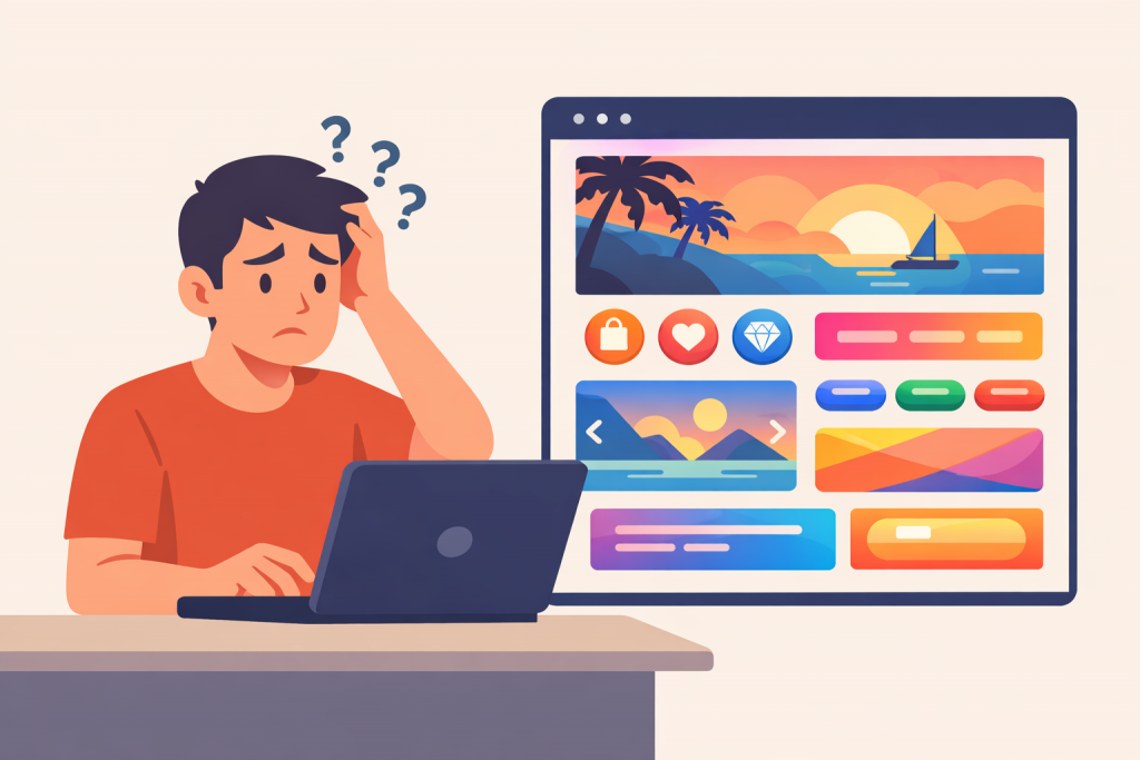
One of the most common mistakes is a situation where design starts to “compete” with content. A user opens the site and sees an impressive first screen but cannot quickly understand what the company actually offers. If within a few seconds it is not clear what product is being sold, who it is for, and why it is worth attention, the visitor simply closes the page. People do not read websites like magazines—they scan them with their eyes in search of answers.
Excessive Creativity and Loss of Trust
Unusual design solutions may look original, but they often create a barrier to perception. When buttons do not look like buttons, menus are hidden without an obvious reason, and navigation requires “getting used to,” the user feels discomfort. In the context of sales, this is especially critical: any confusion reduces trust. Subconsciously, a person thinks that if it is difficult to understand the website, cooperation with the company may be just as difficult.
Slow Performance Caused by “Heavy” Design
Another problem of a beautiful but ineffective design is overloading the site with graphics and animations. Large images, background videos, and complex effects increase page loading time. Website speed directly affects sales: if a page takes more than a few seconds to load, some users simply will not wait. This is especially noticeable on mobile devices or with slow internet connections.
Focus on Aesthetics Instead of Conversion
Conversion is the user’s target action: a purchase, a request, a call, or a registration. A good design can distract from this action if it does not emphasize it. When a page contains many equally prominent elements, bright colors, and visual accents, the user does not understand where exactly to click. As a result, the site looks attractive but does not “guide” the person toward a logical conclusion—the purchase.
Design Without Considering the Real Audience
Often, design is created with trends or personal taste in mind, while the target audience is forgotten. What looks impressive to designers or a young tech-savvy audience may be confusing to entrepreneurs, older clients, or people without digital experience. If the design does not meet the audience’s expectations, it stops being a sales tool and becomes merely a visual experiment.
Balance Between Beauty and Functionality
An effective website is not about rejecting design, but about achieving the right balance. Visual appeal should help convey meaning, not hide it. Good design is subtle: it is logical, clear, and leads the user from the first contact to the target action without unnecessary questions. When every element has a specific purpose, the site starts working for the business rather than simply decorating it.
Technical Foundation Also Matters
Even the most well-thought-out design will not deliver results without a stable technical foundation. Website speed, reliability, and availability depend on the hosting environment. At RX-NAME, you can choose the optimal solution for any project—shared hosting for simple websites, VPS for scalable solutions, or a dedicated server for high-traffic resources. This makes it possible to combine attractive design with stable website performance and avoid losing sales due to technical limitations.
Leave a Reply